Indian e-Visae-Visa portal redesignCase study
UX4G Design System 2.0 · Case study

Redesigning India's e-Visa portal

A government service used by millions of travellers, rebuilt on the UX4G design system — calmer, clearer, mobile-ready and accessible by default, without losing a single piece of essential content.

Government servicesAccessibility-firstWCAG 2.2 AAResponsivePlain language
One
clear primary action
A single, prominent “Apply now” path replaces a wall of equally-weighted buttons.
3-tier
government header
Utility strip, emblem masthead and primary navigation — a recognised gov pattern.
4-step
guided application
A stepper, autosave and a live summary replace one long, intimidating form.
AA
WCAG 2.2 conformance
Visible focus, 44px targets, text resizing and reduced-motion support throughout.
01 · The problem

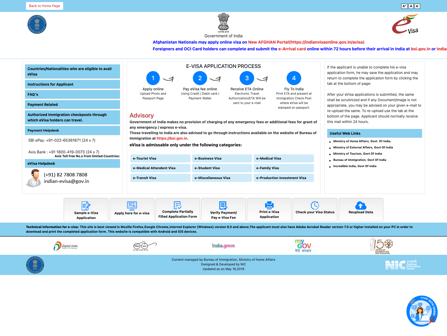
A trusted service that was hard to use

The original portal contained everything a traveller needs — but presented it as an undifferentiated wall of boxes, buttons and moving text. The content was right; the experience wasn't.

Beforeindianvisaonline.gov.in/evisa — the original portal
The original India e-Visa portal
1
No visual hierarchy
Every block competed for attention with equal weight — the eye had nowhere to land and no obvious place to start.
2
No clear call to action
“Apply” was one of seven identical grey buttons in a row, indistinguishable from “Print” or “Re-upload”.
3
A scrolling marquee
Critical notices moved continuously, were unpausable and unreadable for many users — an accessibility and comprehension problem.
4
Dense, dated styling
Tightly-packed blue boxes, mixed fonts and inconsistent spacing read as an older, less trustworthy interface.
5
Not built for mobile
A fixed desktop layout meant pinching and horizontal scrolling on the phones most travellers actually use.
6
Buried, fragmented help
Phone numbers, advisories and links were scattered across the page with no clear grouping.
02 · Research & insights

What informed the redesign

This phase was an expert review, not field research: a heuristic audit of the original portal, a task analysis of what travellers come to do, and a standards review against the obligations that bind Indian government services.

Heuristic auditTraveller task analysisGIGW 3.0WCAG 2.2 AARPwD ActUX4G content guidance
Insight 01

One task dominates

Of the original page's many equally-weighted actions — apply, pay, verify, print, re-upload, check status — applying is the task almost every first-time visitor arrives to do. The page should be organised around it.

Insight 02

Mobile is the first screen

Travellers reach the portal from search, on their phones, often mid-planning. A fixed desktop layout turns the most common context into the hardest one.

Insight 03

Getting stuck is the norm

The original page gives top billing to four helplines and re-upload instructions — strong evidence that applicants routinely hit dead ends the interface itself should prevent.

Insight 04

Trust comes from familiarity

Citizens recognise official services by shared government patterns — the emblem masthead, the tricolour strip, the accessibility bar. Departing from them costs credibility.

03 · Approach

Four principles, drawn from UX4G

The UX4G design system gave us the tokens, components and content guidance. These principles shaped how we applied them.

Lead with one action

Most visitors come to do one thing: apply. The redesign makes that the unmistakable primary path and lets everything else support it.

Plain, reassuring language

Headings and labels speak to the traveller in plain English, explaining what to do and what happens next — in line with UX4G's content voice.

Accessible by default

Accessibility is built into the tokens and components, not bolted on: focus, contrast, target size, motion and a universal-access widget.

Consistent with government

The three-tier emblem masthead, tricolour strip and portal footer make it instantly read as an official Government of India service.

04 · Process & iterations

From audit to government-grade

The redesign moved in deliberate passes: rebuild the service on UX4G's defaults first, then re-theme and harden it into a recognisable Government of India portal. Nothing essential from the original was removed at any stage.

Baseline
Original e-Visa portal
The audit artefact: every box, button, notice and helpline on the original page was inventoried so no content would be lost.
Iteration 1
First iteration on UX4G defaults
First pass on UX4G 2.0 defaults — the violet theme, a welcoming hero and one primary action — to prove the hierarchy before any theming.
Iteration 2
Re-themed government portal
Re-themed via UX4G's themeable primary to a gov blue, with the emblem masthead, a denser portal layout and a “Before you start” rail.
Iteration 3
Guided four-step application
The application itself: a four-step guided flow with a stepper, a live summary rail and automatic saving.
05 · Key decisions

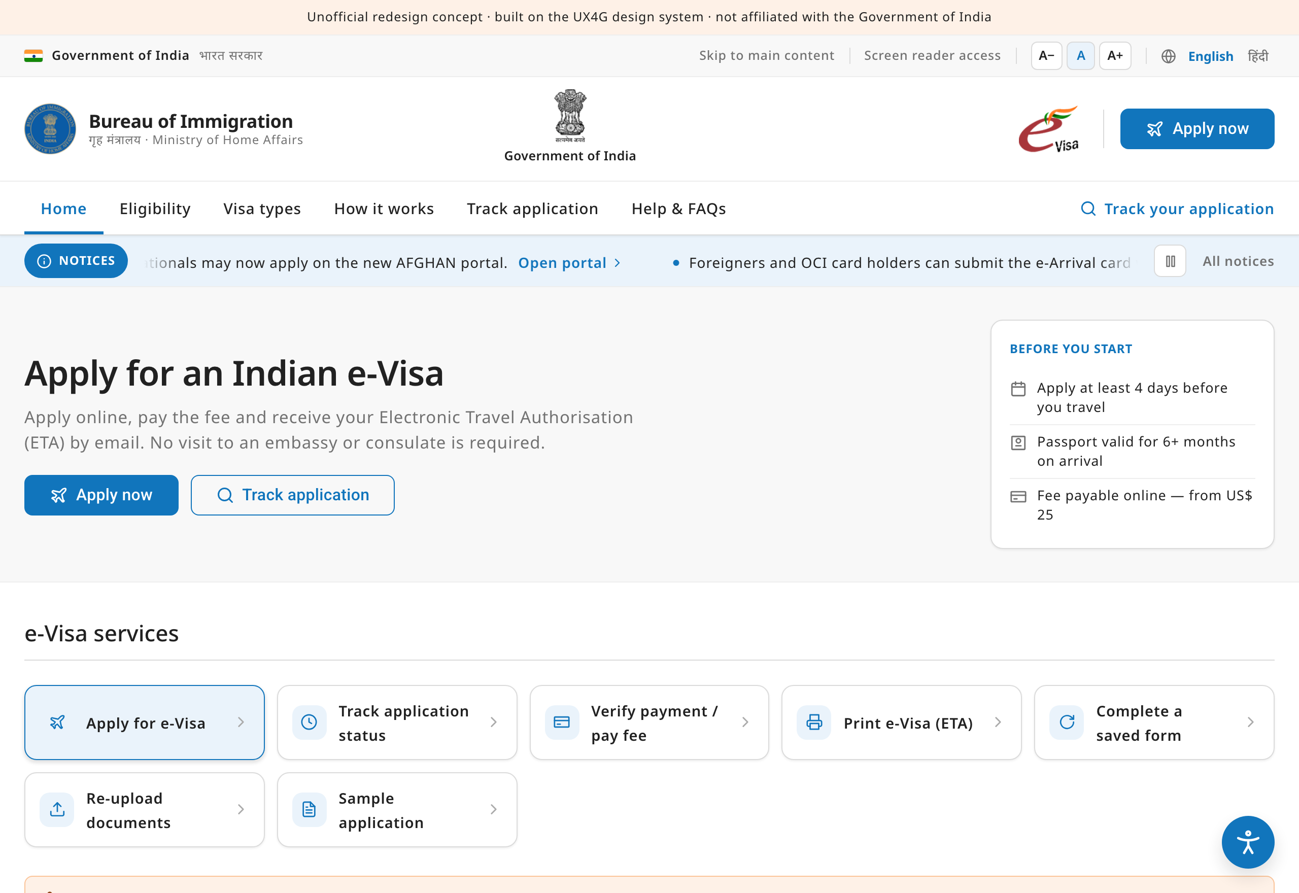
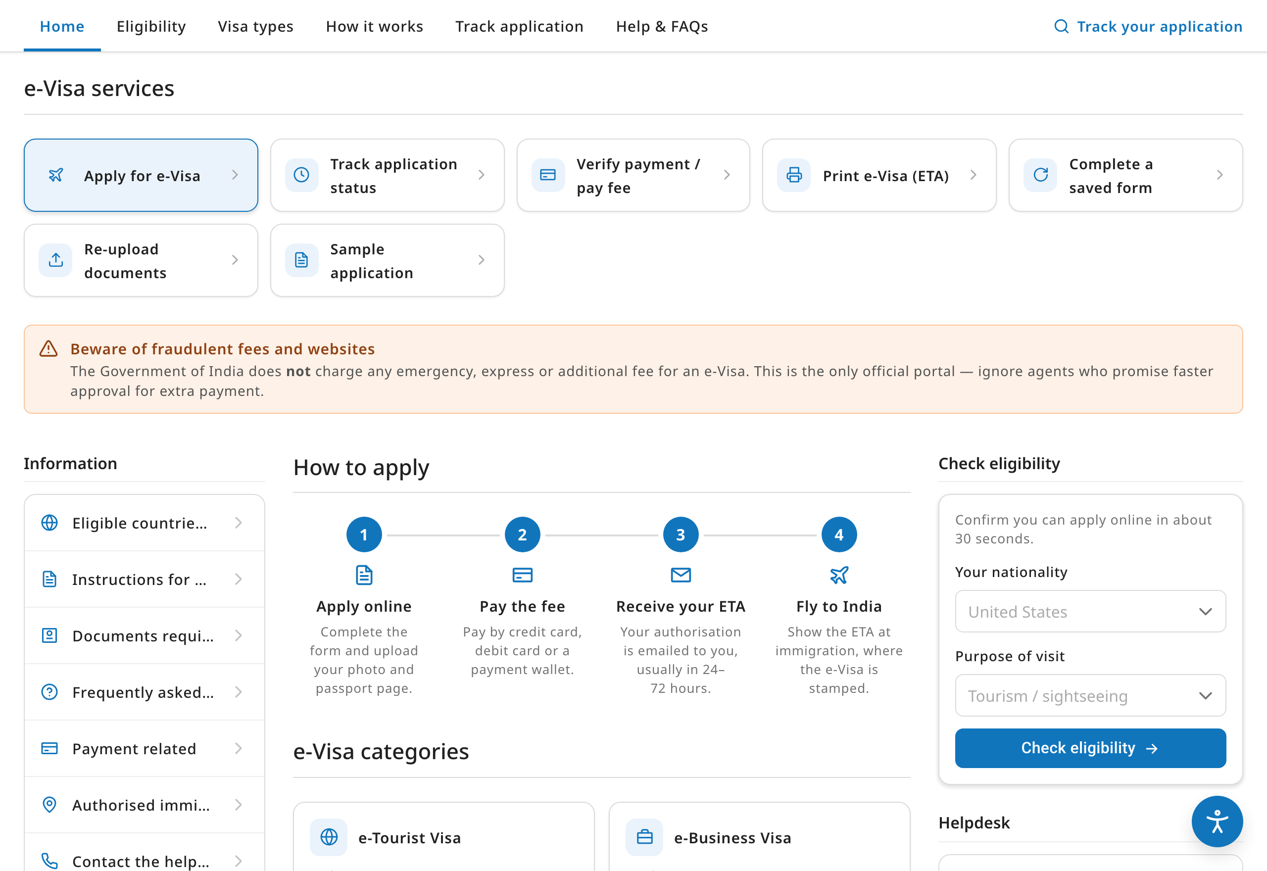
What changed, and why

Information architecture
Problem

Seven equal buttons and stacked boxes with no grouping.

Solution

A clear top-to-bottom story: apply → how it works → visa types → advisory → manage → help. Returning users get a dedicated “Manage your application” area instead of competing with first-timers.

Hero & eligibility check
Problem

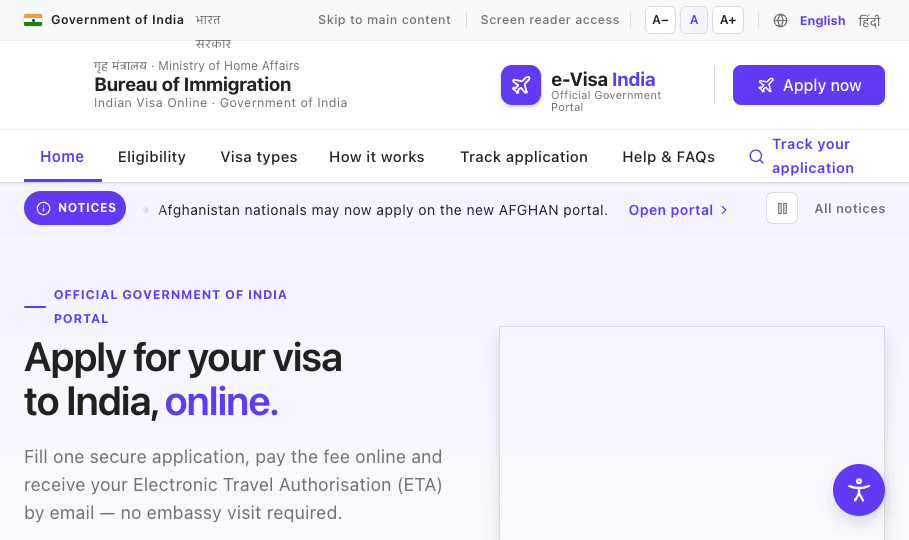
The page opened cold, with no welcome and no guidance on where to start.

Solution

A warm hero states the value in one line and offers a 30-second eligibility quick-check — nationality, purpose and arrival date — so people self-qualify before investing time in the form.

The marquee
Problem

Continuous, unpausable scrolling text carried important legal notices.

Solution

Kept as a clearly-labelled “Notices” ticker that pauses on hover and focus, has an explicit pause control, and fully stops for anyone who prefers reduced motion — the message survives, the barrier doesn't.

Visa categories
Problem

Nine visa types listed as flat blue links.

Solution

Scannable cards, each with an icon, a one-line plain-language description and indicative validity, so travellers can recognise the right category at a glance.

Guided application
Problem

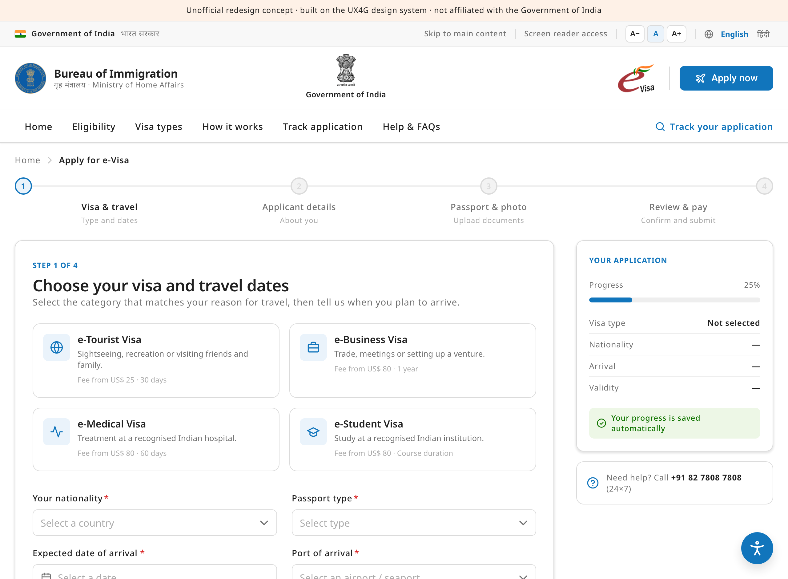
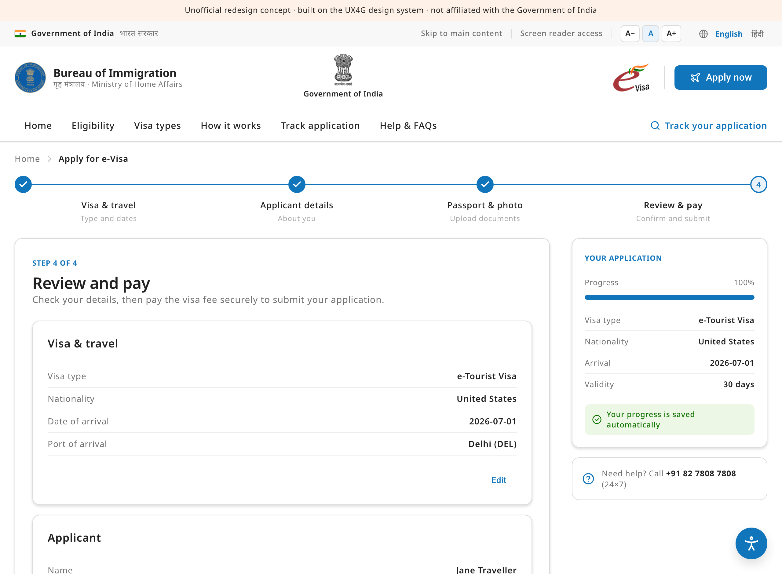
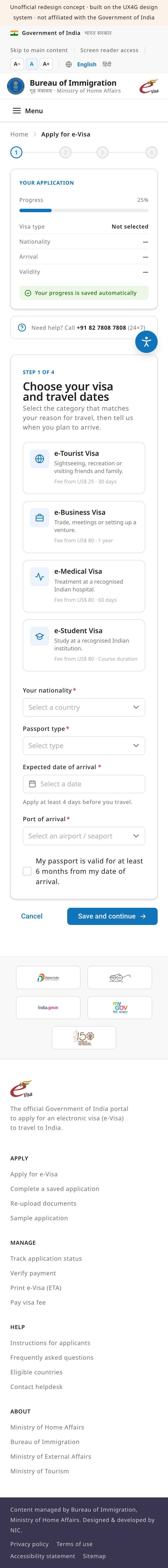
Applying meant facing one long, unforgiving form.

Solution

A four-step flow with a progress stepper, a live application summary, automatic saving and inline validation — breaking a daunting task into calm, recoverable steps.

Help & trust
Problem

Helpdesk numbers, advisories and partner logos were scattered.

Solution

Consolidated into a single help section with an FAQ accordion and clearly-grouped helpdesk contacts, plus a prominent anti-fraud advisory and a trust-badge band in the footer.

How to apply
How-to-apply process and eligibility check
The four-step process strip and the 30-second eligibility quick-check, side by side on the landing page.
Review & pay
Review and pay step
The final review step: completed stepper, a full summary of entered details and a clear, single payment action.
06 · Mobile

The same service in one hand

Most travellers will meet this service on a phone. These are captures of the actual redesign rendered at 390px — or open either page and resize the window to try it yourself.

Redesigned portal at phone width
The landing page at 390px — single column, menu button, the apply action always within reach.
Apply flow at phone width
The guided application at 390px — full-width fields, the summary above the form, autosave throughout.
Navigation collapses
The primary nav folds into a menu button; “Apply now” stays visible in the masthead.
Content reflows, never shrinks
The portal grid, process strip and category cards stack into a single column — no pinching, no horizontal scrolling.
The form stays recoverable
On the apply flow the summary rail moves above the form, fields go full-width and progress keeps saving automatically.
Targets stay generous
Every control keeps the 44px minimum target, regardless of screen size.
07 · Accessibility

Built to be used by everyone

Government services must work for every citizen. Accessibility was a constraint from the first token, aligned with WCAG 2.2 AA, GIGW 3.0 and the RPwD Act.

Visible focus
Every interactive element carries the signature 4px focus halo plus a 2px keyboard outline — never removed.
44px targets
Buttons, links and controls meet the minimum 44×44px touch and click target size.
Text resizing
The utility strip lets anyone scale text up or down; the preference persists across visits.
Reduced motion
The notices ticker and all transitions respect prefers-reduced-motion and stop entirely when requested.
Real form semantics
Labels, required indicators, helper text and error states are wired with proper ARIA, never colour alone.
Universal-access widget
The UX4G accessibility launcher offers contrast, spacing, dyslexia-friendly font, link highlighting and more.
08 · Measuring success

How we'll know it worked

The redesign has not yet faced live traffic, so this is a measurement plan rather than a results table — the six signals we would instrument from day one.

MetricWhy it mattersSuccess looks like
Application completionThe share of started applications that reach submission — the single clearest measure of whether the guided flow works.Fewer abandoned applications; recoverable drafts resumed and finished.
Time to completeThe redesign promises “most forms take ~15 minutes”; the median should honour that promise.Median completion at or under 15 minutes.
Helpdesk contact rateThe original page leads with four helplines — every avoidable call is a sign the interface failed first.Fewer contacts per 1,000 applications about form, payment and re-upload issues.
Mobile parityPhones are the most common context; success there can't lag the desktop experience.Mobile completion within a few points of desktop.
Ineligible entriesThe 30-second eligibility check should stop people investing time in applications that will be refused.Fewer ineligible applications entering — and being rejected from — the form.
Accessibility conformanceWCAG 2.2 AA is an obligation, not an aspiration, for a government service.A clean independent audit plus task success in assistive-technology testing.
09 · Design system & next steps

Everything is UX4G

The redesign composes UX4G 2.0 components and tokens — re-themed to a government blue through the system's own themeable primary, with the 8-point spacing grid and the soft elevation scale — so it stays consistent with the wider family of Indian government services.

Navbar patternFooterButtonCardAlertBadgeChipInputSelectDatePickerCheckboxFileUploadStepperBreadcrumbAccordionProgressTableAccessibilityWidget

What's next

1
Test with travellers
Moderated usability sessions — including participants using screen readers and magnification — to validate the expert-review insights against real behaviour.
2
Localise the service
Hindi and regional-language versions; Noto Sans was chosen precisely for its Indic-script coverage, so the type system is ready.
3
Connect the real journeys
Wire the apply, payment and track-application flows to live services, including the e-mail touchpoints where the ETA actually arrives.
4
Instrument and iterate
Ship the measurement plan above with the service, publish the numbers, and let them drive the next round of changes.